XY plots
XY plots are achieved by using the plot function
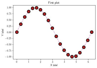
Simple XY plots
import matplotlib as mp
import matplotlib.pyplot as plt
import numpy as np

x = np.linspace(0, 2*np.pi, 20)
y = np.sin(x)
z = np.cos(x)
t = np.tan(x)
t = np.ma.masked_where(np.abs(t) > 100, t)
fig = plt.figure() #  initialize figure
ax = plt.gca() # initialize axis (here, optional)
plt.plot(x, y, color='Plum', linestyle='--', linewidth=2,
         marker='o', markeredgewidth=2, markerfacecolor='FireBrick',
         markeredgecolor='black', markersize=12)
plt.title('First plot')
plt.xlabel('X label')
plt.ylabel('Y label')

# plt.savefig('figs/xy.pdf', bbox_inches='tight') # save the figure
# tight: remove the white spaces around the figure

plt.show()  # display the figure

plt.close(fig)
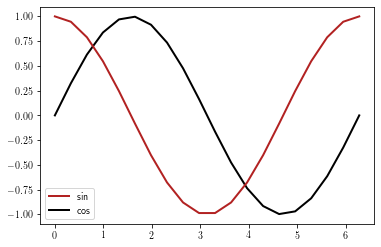
Multiline XY plots
There is several ways to plot multiline XY plots.
First, this can be achieved by using the label argument of the plot function:
fig = plt.figure()
ax = plt.gca()
l0 = plt.plot(x, y, label='sin')
l1 = plt.plot(x, z, label='cos')
leg = plt.legend(fontsize=10, loc=0, ncol=1)
plt.show()

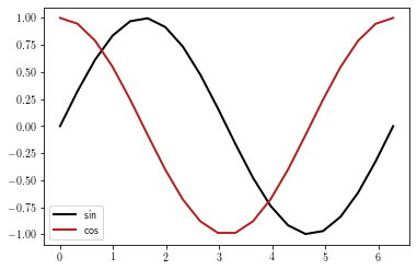
You can also set the legend by providing a list of matplotlib.lines.Line2D objects and their corresponding labels. However, it remains to user to be sure that the right label goes with the right line.
fig = plt.figure()
ax = plt.gca()
l0 = plt.plot(x, y)
l1 = plt.plot(x, z)
leg = plt.legend([l1[0], l0[0]], ['sin', 'cos'], loc=0, ncol=1, fontsize=10)
plt.show()
1D Arrays can be comined into a multidimensional one prior to plotting. The first dimension of the y array must have the same number
of elements as the x array.
In this case, the user needs to set the legend by providing the list of the corresponding labels (the user must insure that the right label goes with the right line)
arr =  np.array([y, z]).T
print(arr.shape)

fig = plt.figure()
ax = plt.gca()
plt.plot(x, arr)
leg = plt.legend(['sin', 'cos'], loc=0, ncol=1, fontsize=10)
(20, 2)
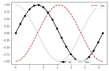
If several legends should be plotted, they must be added to the current graph by using the matplotlib.axes.Axes.add_artist function:
fig = plt.figure() #initialize figure
ax = plt.gca()

l0 = plt.plot(x, y, marker='o')
l1 = plt.plot(x, z, color='0.8')
l2 = plt.plot(x, -z, linestyle='--')

# Draw the legend for the
leg1 = plt.legend([l0[0], l1[0]], ['sin', 'cos'],
                  loc=(0.5, 0), ncol=2)
# add legend to the axes
ax.add_artist(leg1)

# Draw second legend
leg2 = plt.legend([l2[0]], ['-cos'], loc=1)
plt.show()
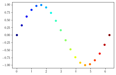
Using colortable colors
To use colormap colors to draw xy plots, you first need to define a colormap object:
cmap = plt.cm.jet # Defining colormap (cf. matplotlib website)
print(cmap(0))  # picks the first color (blue)
print(cmap(1.))  # picks the first color (red)
(0.0, 0.0, 0.5, 1.0)
(0.5, 0.0, 0.0, 1.0)
plt.figure()
cmap = plt.cm.jet # Defining colormap (cf. matplotlib website)
for p in range(0, len(x)):
    cindex = p / (len(x) - 1)  # value between 0 and 1
    color = cmap(cindex)
    plt.plot(x[p:p+1], y[p:p+1], color=color, linestyle='none', marker='o')
plt.show()
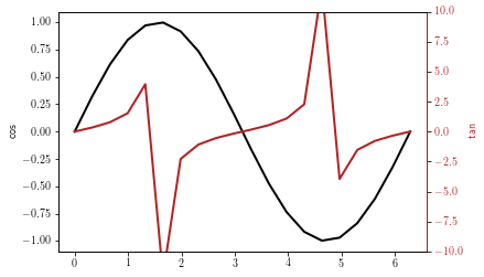
Using twin axis
Using twin axis (shared x or shared y) is achieved by using the twinx or twiny methods.
# Shared x and y axis
plt.figure()
ax1 = plt.gca()
ax1.plot(x, y, 'k')
ax1.set_ylabel('cos', color='k')

ax2 = ax1.twinx()
ax2.plot(x, t, color='FireBrick')
ax2.set_ylim(-10, 10)
ax2.set_ylabel('tan', color='FireBrick')
plt.setp(ax2.get_yticklabels(), color='FireBrick')
ax2.spines['right'].set_color('FireBrick')

plt.show()
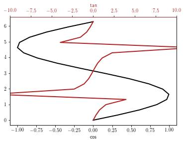
plt.figure()
ax1 = plt.gca()
ax1.plot(y, x, 'k')
ax1.set_xlabel('cos', color='k')

ax2 = ax1.twiny()
ax2.plot(t, x, color='FireBrick')
ax2.set_xlabel('tan', color='FireBrick')
ax2.set_xlim(-10, 10)
plt.setp(ax2.get_xticklabels(), color='FireBrick')
ax2.spines['top'].set_color('FireBrick')

plt.show()
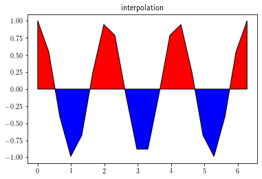
Filled XY plots
Filled XY plots are achieved by using the fill_between function.
It is highly recommended to set interpolate to True to insure a proper layout.
y = np.cos(3 * x)

fig = plt.figure()
ax = plt.gca()
ax.set_title('no interpolation')
ax.fill_between(x, 0, y, facecolor='r', where=y>0,
                 interpolate=False, edgecolor='k')
ax.fill_between(x, 0, y, facecolor='b', where=y<0,
                 interpolate=False, edgecolor='k')
plt.show()
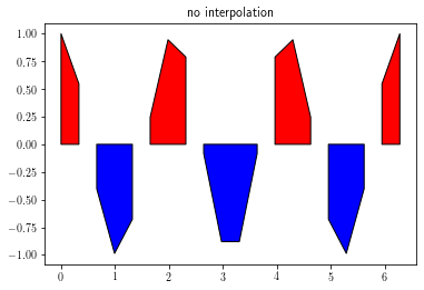
fig = plt.figure()
ax = plt.gca()
ax.set_title('interpolation')
ax.fill_between(x, 0, y, facecolor='r', where=y>0,
                 interpolate=True, edgecolor='k')
ax.fill_between(x, 0, y, facecolor='b', where=y<0,
                 interpolate=True, edgecolor='k')
plt.show()