2D plots
Contour lines
Contour plots are done by using the contour function.
import matplotlib.pyplot as plt
import numpy as np
import matplotlib.mlab as mlab
import matplotlib as mp

delta = 0.025
x = np.arange(-3.0, 3.0, delta)
y = np.arange(-2.0, 2.0, delta)
xx, yy = np.meshgrid(x, y)
zz = xx * yy
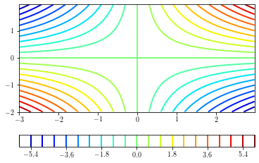
Simple contour plots
A simple contour plot can be done by providing the number of levels to draw (determined from the minimum and maximum values of the data) to draw.
plt.figure()
ax = plt.gca()
cs = plt.contour(xx, yy, zz, 21, cmap=plt.cm.jet) # 21 contours drawn
cb = plt.colorbar(cs, orientation='horizontal')
plt.show()
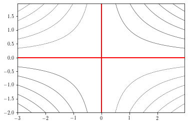
To specify the levels to draw, you can provide a levels argument:
plt.figure()
cs = plt.contour(xx, yy, zz, levels=np.arange(-6, 7, 1),  # specif
                 linewidths=0.5, colors='k')
plt.contour(xx, yy, zz, levels=0, colors='r') # draw 0 contour
plt.show()
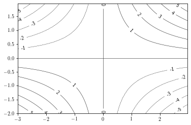
Adding labels
Adding contour labels can be done by providing a list of labels to draw and a string formatting.
If the manual argument is set to True, the user can choose where the labels are put.
plt.figure()
cs = plt.contour(xx, yy, zz, levels=np.arange(-6, 7, 1),  # specif
                 linewidths=0.5, colors='k')
plt.clabel(cs, cs.levels, fmt="%.1d", manual=False)
plt.show()
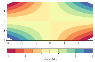
Filled contours
Fille contours are achieved by using the contourf function
plt.figure()
ax = plt.gca()
cs = plt.contourf(xx, yy, zz,
                  levels = np.arange(-5, 6, 1),
                  cmap=plt.cm.get_cmap('Spectral'), #_r means reverse cmap
                  )
cb = plt.colorbar(cs,orientation='horizontal', drawedges=True) # add the colorbar
cb.set_ticks(cs.levels[::2])
cb.set_label('Colorbar label')
plt.show()
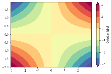
By default, data outside the level range are not shown (appear as background). To overcome this, set the
extend argument to 'both'
plt.figure()
ax = plt.gca()
cs = plt.contourf(xx, yy, zz,
                  levels=np.arange(-5, 6, 1),
                  cmap=plt.cm.get_cmap('Spectral_r'), #_r means reverse cmap
                  extend='both') # extend means to saturate the colors (instead of masking)
cb = plt.colorbar(cs, orientation='vertical', drawedges=False) # add the colorbar
cb.set_ticks(cs.levels[::2])
cb.set_label('Colorbar label')
plt.show()
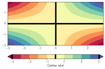
To overlay a contour lines over a filled contour, simply call the contour function after the contourf one. You can recover the plotted levels, use the levels attributes.
To add the contour lines on the filled contour colorbar, use the add_lines method
plt.figure()
ax = plt.gca()
cs = plt.contourf(xx, yy, zz,
                  levels = np.arange(-5, 6, 1),
                  cmap=plt.cm.get_cmap('Spectral'),
                  extend='both')
cb = plt.colorbar(cs, orientation='horizontal')
cb.set_ticks(cs.levels[::2])
cb.set_label('Colorbar label')
cl = plt.contour(xx, yy, zz, levels=0, colors='k', linewidths=5)
cb.add_lines(cl)
plt.show()
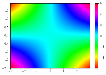
Pcolors
Colored mesh are achieved by using the pcolor and the pcolormesh functions.
The second is faster than the former.
plt.figure()
ax = plt.gca()
cs = plt.pcolor(xx, yy, zz, cmap=plt.cm.get_cmap('hsv'), edgecolors='none')
plt.colorbar(cs)
plt.xlim(np.min(xx), np.max(xx))
plt.ylim(np.min(yy), np.max(yy))
plt.show()
/home/barrier/Softwares/anaconda3/lib/python3.7/site-packages/ipykernel_launcher.py:3: MatplotlibDeprecationWarning: shading='flat' when X and Y have the same dimensions as C is deprecated since 3.3.  Either specify the corners of the quadrilaterals with X and Y, or pass shading='auto', 'nearest' or 'gouraud', or set rcParams['pcolor.shading'].  This will become an error two minor releases later.
  This is separate from the ipykernel package so we can avoid doing imports until
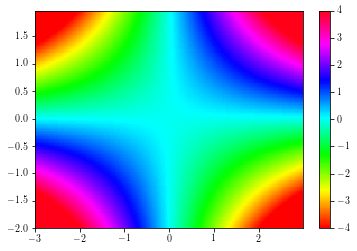
To change the color limits, use the set_clim method.
plt.figure()
ax = plt.gca()
cs = plt.pcolormesh(xx, yy, zz, cmap=plt.cm.get_cmap('hsv'))
cs.set_clim(-4, 4)
plt.colorbar(cs)
plt.xlim(np.min(xx), np.max(xx))
plt.ylim(np.min(yy), np.max(yy))
plt.show()
/home/barrier/Softwares/anaconda3/lib/python3.7/site-packages/ipykernel_launcher.py:3: MatplotlibDeprecationWarning: shading='flat' when X and Y have the same dimensions as C is deprecated since 3.3.  Either specify the corners of the quadrilaterals with X and Y, or pass shading='auto', 'nearest' or 'gouraud', or set rcParams['pcolor.shading'].  This will become an error two minor releases later.
  This is separate from the ipykernel package so we can avoid doing imports until
Imshow
# Preparing some data and functions to show how imshow works
bbox = dict(boxstyle="round,pad=0.3", fc="lightgray", ec="k", lw=1)
def add_text():
for i in range(0, len(x)):
for j in range(0, len(y)):
plt.text(x[i], y[j], data[i, j], ha='center', va='center', bbox=bbox)
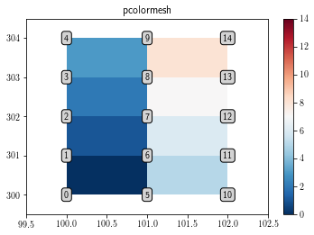
data = np.arange(0, 15)
data = np.reshape(data, (3, 5))
x = np.arange(3) + 100
y = np.arange(5) + 300
pcolor and pcolormesh interpolate the data. Therefore, plotting the (3, 5) array with them only shows (2, 4) pixels.
fig = plt.figure()
plt.gca()
cs = plt.pcolormesh(x, y, data.T)
plt.colorbar(cs)
cs.set_clim(data.min(), data.max())
add_text()
plt.xlim(x.min()-0.5, x.max()+0.5)
plt.ylim(y.min()-0.5, y.max()+0.5)
plt.title('pcolormesh')
plt.show()
/home/barrier/Softwares/anaconda3/lib/python3.7/site-packages/ipykernel_launcher.py:3: MatplotlibDeprecationWarning: shading='flat' when X and Y have the same dimensions as C is deprecated since 3.3.  Either specify the corners of the quadrilaterals with X and Y, or pass shading='auto', 'nearest' or 'gouraud', or set rcParams['pcolor.shading'].  This will become an error two minor releases later.
  This is separate from the ipykernel package so we can avoid doing imports until
To display all the data cells without any interpolation, use the imshow function as follows:s
fig = plt.figure()
ax = plt.gca()
plt.title('imshow')
cs = ax.imshow(data.T, interpolation='none') # int = none fails on PDF
plt.colorbar(cs)
plt.show()
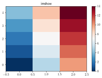
By default, the imshow function displays the figure with x and y as pixel indices. Furthermore, one can notice that by default imshow function displays the [0, 0] corner at the upper left corner.
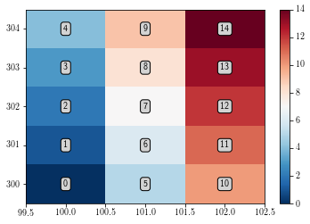
In order to draw the figure in the right way:
set the
originargument as equal tolower, in order to have the[0, 0]point at the lower left corner.Add the data limits by using the
extentargument, which should be a 4 element.
plt.figure()
ax = plt.gca()
extent = [x.min()-0.5, x.max()+0.5, y.min()-0.5, y.max()+0.5]
cs = ax.imshow(data.T, interpolation="none", extent=extent, origin='lower') # int = none fails on PDF
plt.colorbar(cs)
add_text()
plt.show()
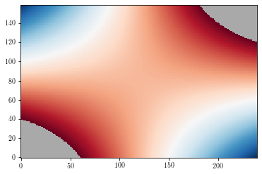
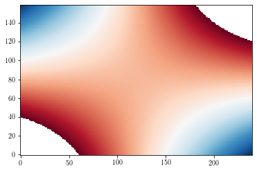
Masked values
By default, masked values are shown in background colors (white by default).
zzm = np.ma.masked_where(np.abs(zz>=3), zz)

plt.figure()
cs = plt.imshow(zzm, origin='lower')
plt.show()
To change the default background color, use the set_facecolor method.
plt.figure()
ax = plt.gca()
ax.set_facecolor('DarkGray')
cs = plt.imshow(zzm, origin='lower')
plt.show()