Managing axis
In this section, some features about axes manipulation will be shown. First, let’s create some data.
import matplotlib.pyplot as plt
import matplotlib as mp
import numpy as np

x = np.linspace(0, 2*np.pi, 30)
y = np.sin(x)
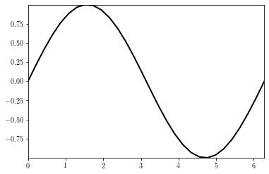
Changing the plot limits
# Setting the limits of the figure
fig = plt.figure()
ax = plt.gca()
plt.plot(x, y)
plt.xlim(x.min(), x.max())
plt.ylim(y.min(), y.max())

plt.show()
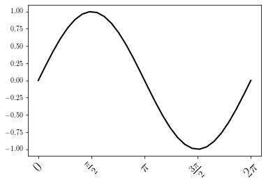
Changing the ticks and tick labels
Changing the tick locations and tick labels are achieved by using the set_xticks and set_xticklabels methods.
# Tick handling
fig = plt.figure()
ax = plt.gca()
plt.plot(x, y)

# Defines location of xticks and sets the xticklabels
# $$ stands for mathematical writting
xticks = np.arange(0, 2*np.pi+np.pi/2., np.pi/2)
xticklabels = ["$0$", r"$\frac{\pi}{2}$", "$\pi$", r"$\frac{3\pi}{2}$", '$2\pi$']

# Length of xticks and xticklabels should be the same
ax.set_xticks(xticks)
ax.set_xticklabels(xticklabels, rotation=45, ha='center', fontsize=20)

plt.show()
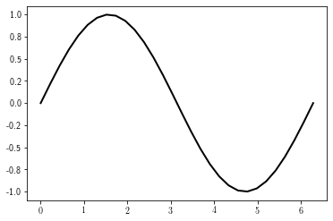
Same thing can be done for the y-axis
fig = plt.figure()
ax = plt.gca()
plt.plot(x, y)

# Defines location of yticks and sets the yticklabels
yticks = np.arange(-1, 1 + 0.25, 0.25)
yticklabels = ['%.1f' %y for y in yticks]

# Length of yticks and yticklabels should be the same
ax.set_yticks(yticks)
ax.set_yticklabels(yticklabels)

plt.show()
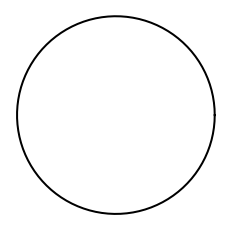
Axis aspect
By defaut, the shape of the axis is set as equal to the shape of the figure. To overcome this, use the axis.axis or the axis.set_aspect method (as shown here.
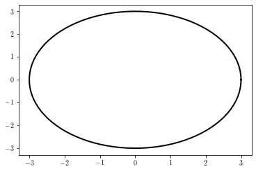
For instance, a circle may look like an ellipse:
import matplotlib.pyplot as plt
import numpy as np

# Plot circle of radius 3.
an = np.linspace(0, 2 * np.pi, 100)
x = 3 * np.cos(an)
y = 3 * np.sin(an)
The figure display will show the data as an ellipse instead of a circle:
fig = plt.figure()
plt.plot(x, y)
plt.show()
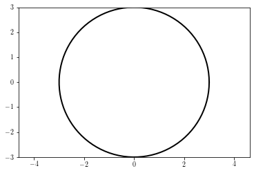
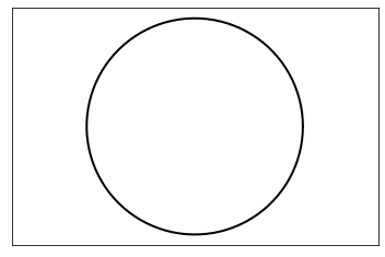
This can be corrected by using the ax.axis method:
fig = plt.figure()
ax = plt.gca()
plt.plot(x, y)
ax.axis('equal') # must be put before the xlim/ylim
ax.set_xlim(-3, 3)
ax.set_ylim(-3, 3)
plt.show()
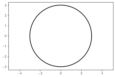
It can be also be achieved by using the set_aspect function, which allows to control whether the axes limits or the axes shape should be modified to insure a proper aspect.
Modifying the data limits:
fig = plt.figure()
ax = plt.gca()
plt.plot(x, y)
ax.set_aspect('equal', 'datalim') # changes the axis limits to have the good aspect
plt.show()
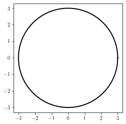
Modifying the axis shape:
fig = plt.figure()
ax = plt.gca()
plt.plot(x, y)
ax.set_aspect('equal', 'box')  # changes the axes shape to have the good aspect
plt.show()
Hiding tick labels
Tick labels can be hidden by using the set_visible method:
fig = plt.figure()
ax = plt.gca()
ax.plot(x, y)
ax.axis('equal')
ax.get_xaxis().set_visible(False)  # removes xlabels
ax.get_yaxis().set_visible(False)  # removes xlabels
plt.show()
Removing axis box
The removal of the axis box is done by calling the axis method with a False argument:
fig = plt.figure()
ax = plt.gca()
ax.set_aspect('equal')
ax.plot(x, y)
ax.axis(False)
plt.show()